

For several months, I’ve created numerous book cover designs for my latest novel, A Blog Affair. It’s not a willy-nilly process, performed in a jiffy, but a careful, well-thought out effort inspired by the unfolding story. You’re probably wondering why I wouldn’t invest in a professional graphic designer. Well, I actually enjoy creating my own covers. But I wouldn’t recommend it for those less graphically inclined. A beautiful professional cover enhances your author’s brand and the investment in an experienced book cover designer is worth it. After all, book covers matter. People are visual and attracted to thought provoking images. A great cover tells your audience you put as much effort into the design as the story behind it.
Front matters! The cover is the first feature a reader sees. Never shortchange fans with a sloppy fonts or images. Although, I hate using clichés, “you can’t judge a book by its cover,” but you can judge the author’s professionalism. Readers are more inclined to buy a book when they connect on an emotional level. Mood, colors, graphic images appeal to reader’s visual perceptions. A good cover acts as a compelling trailer, capturing attention, captivating the senses, and instilling a desire for more. Thus, a quality cover draws and engages reader’s attention, suggests the story’s style, and sways a reader’s purchase decision.
A Blog Affair’s cover is still a work in progress. I’ll continue the creative effort until the right one makes me prickle joyously!
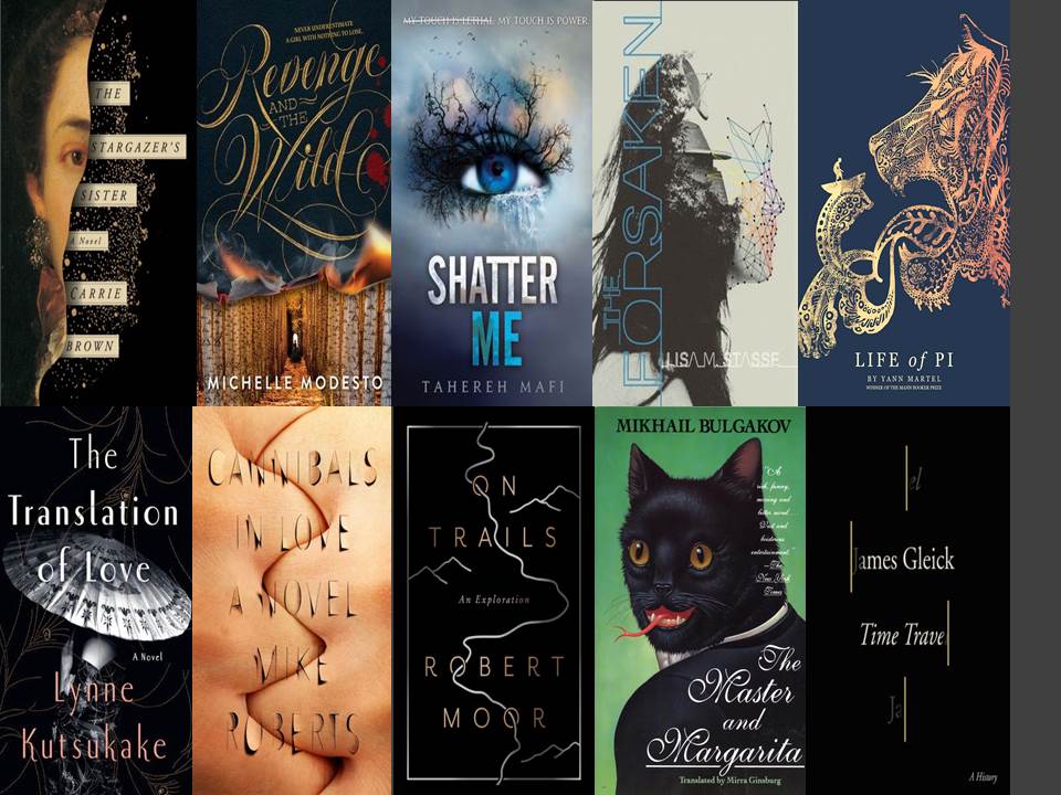
Below are examples of superb book covers I love.
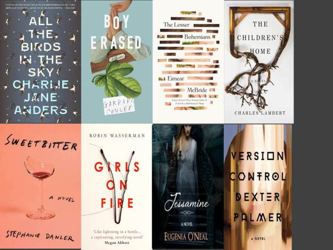
These are three options for A Blog Affair. But, I’m nowhere near done.


Daily Prompts: Willy-nilly, Prickle, Jiffy

i like the second one better where the faces ar not clear..leaving u to imagine …keeping the suspense up…whichever cover u chose All the Best !! n a huge Congratulations:)
LikeLike
Aw!! You hit it on the nail. Mystery. I agree with you. I will probably create more before the book is released. I appreciate your opinion! Thank You!!!
LikeLiked by 1 person
looking forward to it:)
LikeLiked by 1 person
Thanks!! 🙂
LikeLike
Yours covers are fantastic! Do you have a graphic designer? I like to use my own pictures for my covers as I find them more meaningful to me personally. It seems to work for me and identifies me as a person and writer. Keep up the great work !
LikeLike
Dana, thank you!! No, I’ve never used a graphic artist. I love the creative aspect of designing my own cover. I agree with using your own pictures. As the author, you know what you’re trying to portray. And you’re right, it identifies your unique brand. I have to check out your books now 🙂
LikeLiked by 1 person
Dana, I love the biography behind your story Dr. Peacock and Friends. The cover is also catching. Is there a series in the works?
LikeLiked by 1 person
Yes, I have 14 books in the series. They were initially printed by Tate Publishing but they went belly up in January. So I’m looking for a new publisher for them.
LikeLiked by 1 person
14 wow! That’s great. I’m sure they will find a new home. I read the sample on Amazon and I wished I was a kid again. Looks like a wonderful series!
LikeLiked by 1 person
Look out Dr. Seuss!! LOL
LikeLiked by 1 person
Hahaha! You never know Dana!
LikeLiked by 1 person
I like these, creating book covers is something I’m looking at getting into more for my stories, in a way it’s kind of cementing a look and feel of the world story is created in my mind if you know what I mean.
LikeLike
I agree Simon!! You seem to be gifted as a writer and technologically. Find a good graphics software and give it a shot. I’d love to see what you come up with for your short stories. Hint . . . 🙂
LikeLike
I’ve already been working on ideas and how I can do this, it’s why I’ve been busy, as well as writing. But I’ll make sure I show you first if you like. What graphics software do you use?
LikeLike
I’m using several software – Gimpe, Photoshop, PowerPoint. I really like Gimpe which is free to dowload and provided through open source.
LikeLike
I’m glad you said Gimp because I’m an open source fan and Gimp is meant to be very good. Apparently it precedes Photoshop.
I’ve got some work to do to get what I want and a lot of learning but I’m optimistic I can get something pretty good.
LikeLiked by 1 person
Can’t wait to see it!
LikeLike
Denise both are nice, I like the first one but according to ‘idlebrain’ the suspense with the 2nd is really good too… You say you’ve been working on designs for months? Hmmm… I have to start doing that soon, makes me wonder how long I’ll take 🙂 Great job though…
LikeLiked by 2 people
Marts, thank you!! I am truly torn. I still have much work to do on the covers. I will keep posting until I’m satisfied. I value your opinion, again, thank you!!!!!
LikeLike
I forgot to say in my first comment, take as long as you have to. Get, it right, play around and just have fun!
LikeLike
Dennis you’re so talented. They all look so nice, I love the third one”shatter me”, It looks extraordinary. I’m trying to lay my hands on book cover design, just haven’t really had enough time to do so, but I sure will sometime😊
LikeLiked by 1 person
Hi Eddaz. Thank you! Good luck with the book cover. There are great resources out there. Make sure you find the right designer!
LikeLiked by 1 person
Denise, I really like the “depth of field” of the top cover. Not so sure about the stark black bars top and bottom (for your name & sub-title). The bottom cover looks like it’s been stretched vertically too much, especially causing the “tablet” (or laptop?) to look funky. From the top example I’m guessing the setting is Washington, D.C.? Anyway, the top cover caught my eye. I think you have a very good start toward an effective front cover.
–Michael
LikeLiked by 1 person
Michael, that’s the best observation I’ve had so far. Thank you so much! The laptop is so hard to work with. I’m considering doing away with it altogether. But it’s a work in progress and I have to get it right. 🙂
LikeLiked by 1 person
I like the look of the first cover, it pulls me in. Good luck with completing the finalized cover. 🙂
LikeLiked by 1 person
Scarlet, thank you! I can’t wait til I’m done. 🙂
LikeLiked by 1 person
I have to agree. While I’ve never been a fan of that cliche’, I have to admit that I’m much more likely to pick up a book with a cover that catches my eye and draws my attention.
LikeLiked by 1 person
Although overused, it’s a darn good cliche 🙂 Yes, a good cover will always warrant a read of the first couple of pages. That old cliche rings true. The cover might be enthralling, but the story may not be. 🙂
LikeLike
I like the second one very much, had a lot of impact and of course says what it needs to say about the content.
LikeLike
Jane, thank you for the feedback. I’m torn between the first and the second. But the audience’s opinion counts lots!
LikeLike
Of course. Hard decision
LikeLiked by 1 person
The last one stands out the most to me. I judge books cover first, synopsis second, so it means a lot to have a great cover. The third one has the people in the background faded, which I personally prefer. I like the title and what’s it about to stick out more, and the people never give me that feeling, so faded is best in my opinion. A little sharper, wider, and popping and it’ll be great. Always do what you like best though. I know this is probably a really hard decision, lol.
LikeLike
Wow! TizzyMatic thank you. I really love the feedback and I’m taking it all to heart. I’m so torn but by the time I finish the novel I hope I’ve made a decision. Again, thank you!!!!
LikeLiked by 1 person
No problem, I’m always down to help authors. That’s one of three reasons why I blog. You’re greatly welcome.
LikeLike
I notice. I love your blog and can’t wait to see your next posts! 🙂
LikeLiked by 1 person
Thank you! 😀
LikeLiked by 1 person
You deserve it!
LikeLiked by 1 person
That really means a lot. I appreciate it to the fullest.
LikeLiked by 1 person
I paid an artist $70 to make my book cover, but I designed it and she just did the art work as I have no talent in drawing things.
LikeLike
Are you happy with the cover? I just love graphic design and feel I have total control over the process.
LikeLike
I am very happy with my cover! My book is titled the, ‘Ancient Book of Eli’ so I needed something that looked real old school and I found a light brown or tan leather pattern that would look good with text floating on top of it. I told my artist to put a simple boarder pattern around the edges and I wanted a fish symbol in the center of the cover because my book deals loosely with Christianity. I had the following words positioned over the cover that she made. This book has been trained to sit patiently on the shelf and hold its magic between the covers, until someone wants to read stories about gods, giants, monsters and much more. This book can paint pictures in your mind, bring your dreams to life, allow you to get in touch with your spiritual side, enable your desires and take you to far off places in another time. This book does not want to be judged by its cover, so grab it, take it off the shelf and crack it open. A rogue drone just delivered this subliminal message, “I am calling on you to pick me up and start reading.”
LikeLiked by 1 person
Hahaha! Sounds like a great cover and a great book! I hope one day I can find time in my busy schedule to read it. I hope it won’t escape on magic wings. Thanks for the post 🙂
LikeLiked by 1 person